Six concept projects. Six different businesses to think through.
Each project below is an original concept study, not a completed client engagement — built to show how we'd approach the strategy and design for that kind of business.
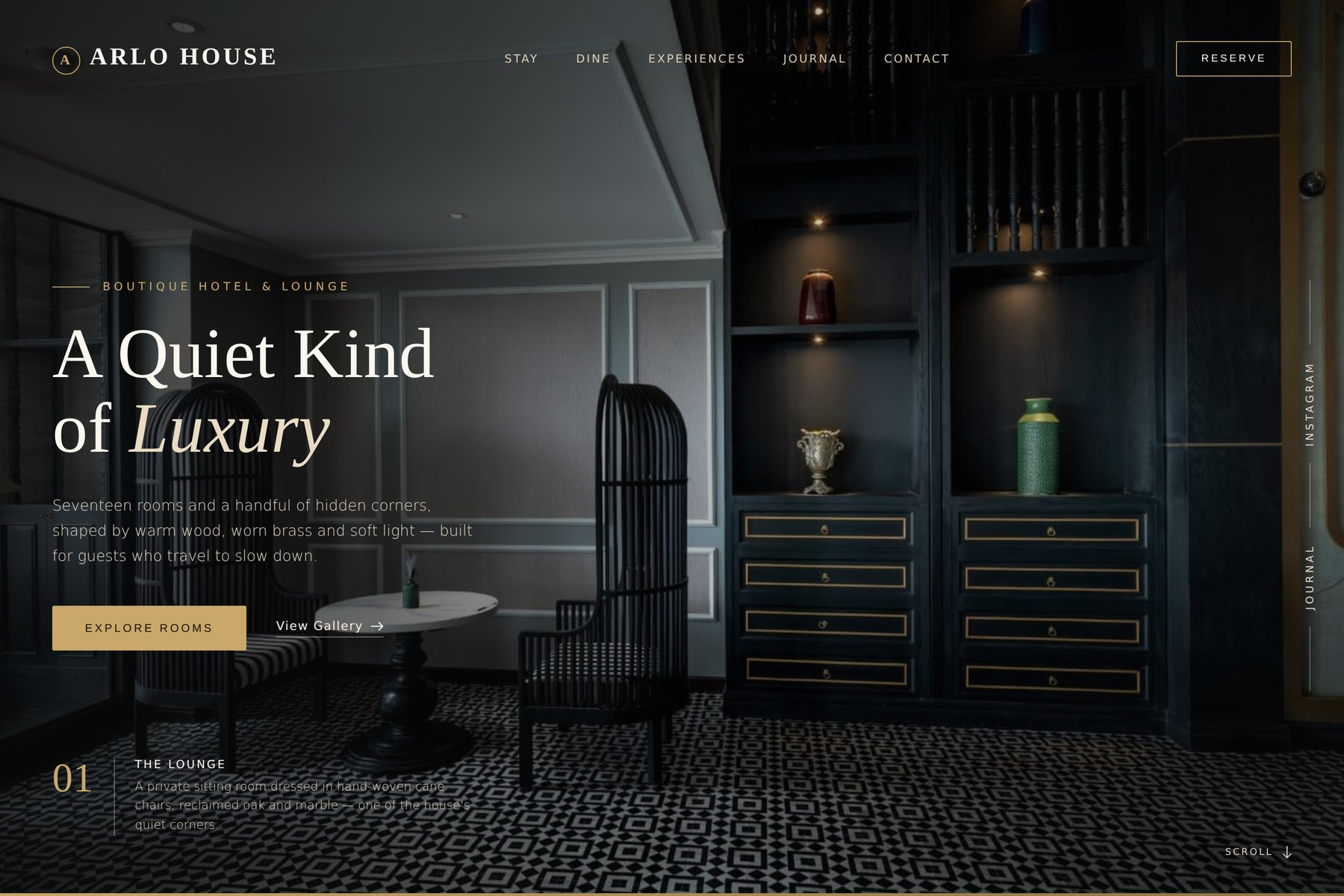
AURA
A quiet, editorial site for a boutique hotel built on restraint.
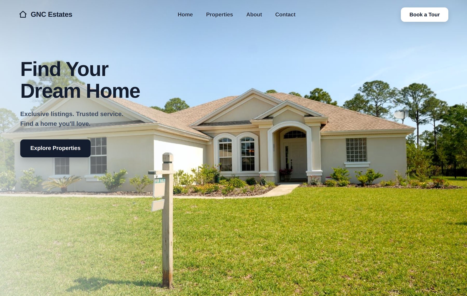
VANTAGE
A listings-first site designed to move buyers from scroll to tour.
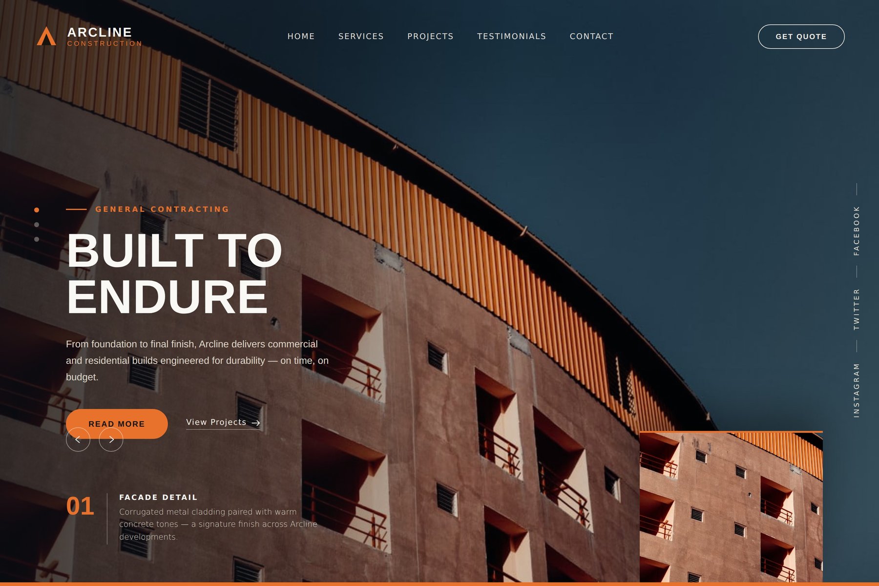
FORGE
A confident, industrial identity for a builder that competes on trust.
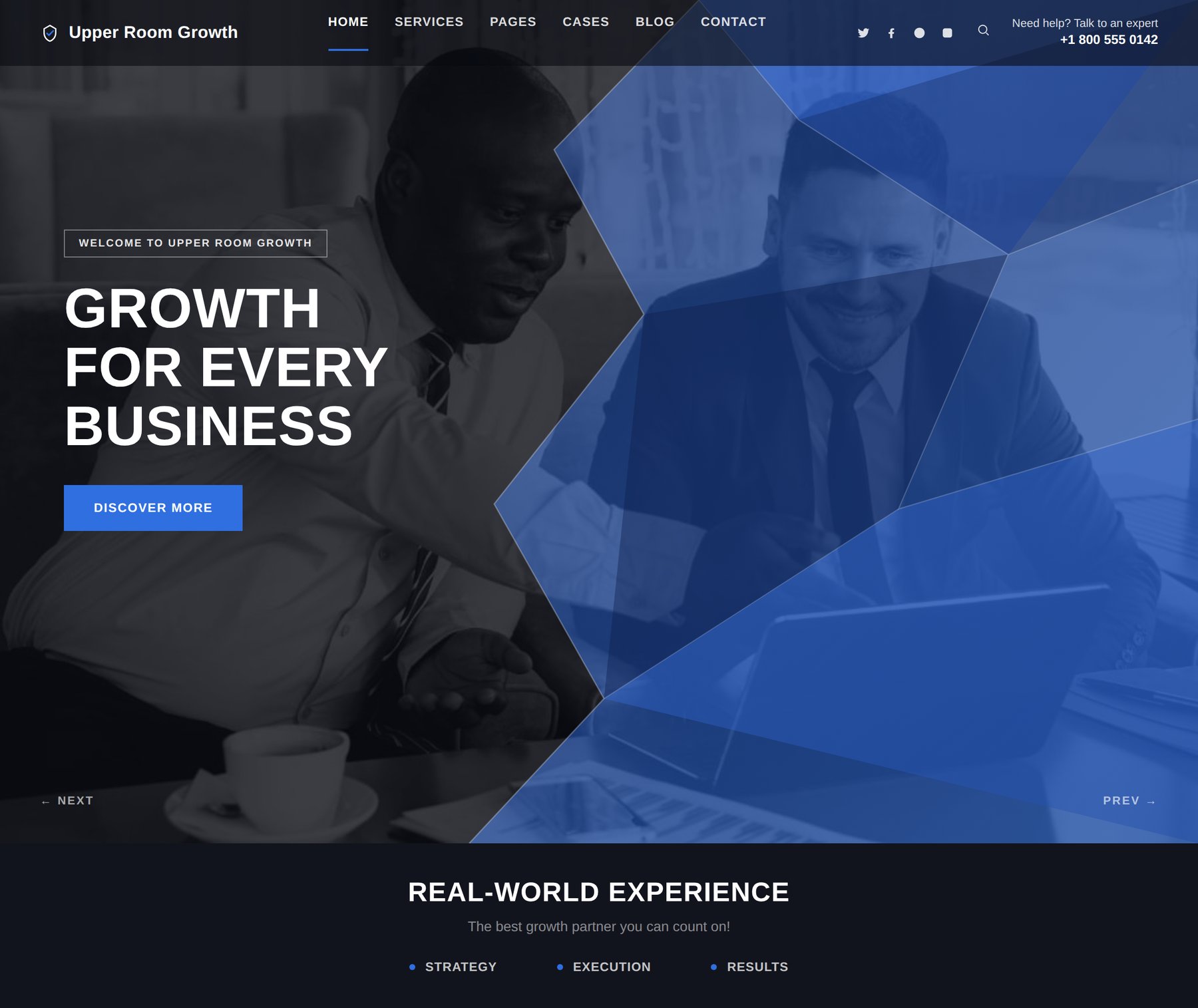
NORTHSTAR
A confident consulting front door built for a first, considered impression.
VERDE
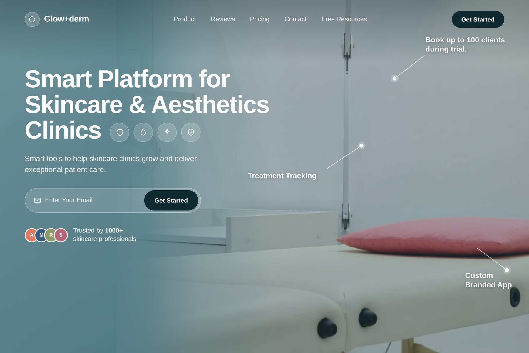
A calm, clinical-meets-boutique platform for a modern skincare brand.
NOVA
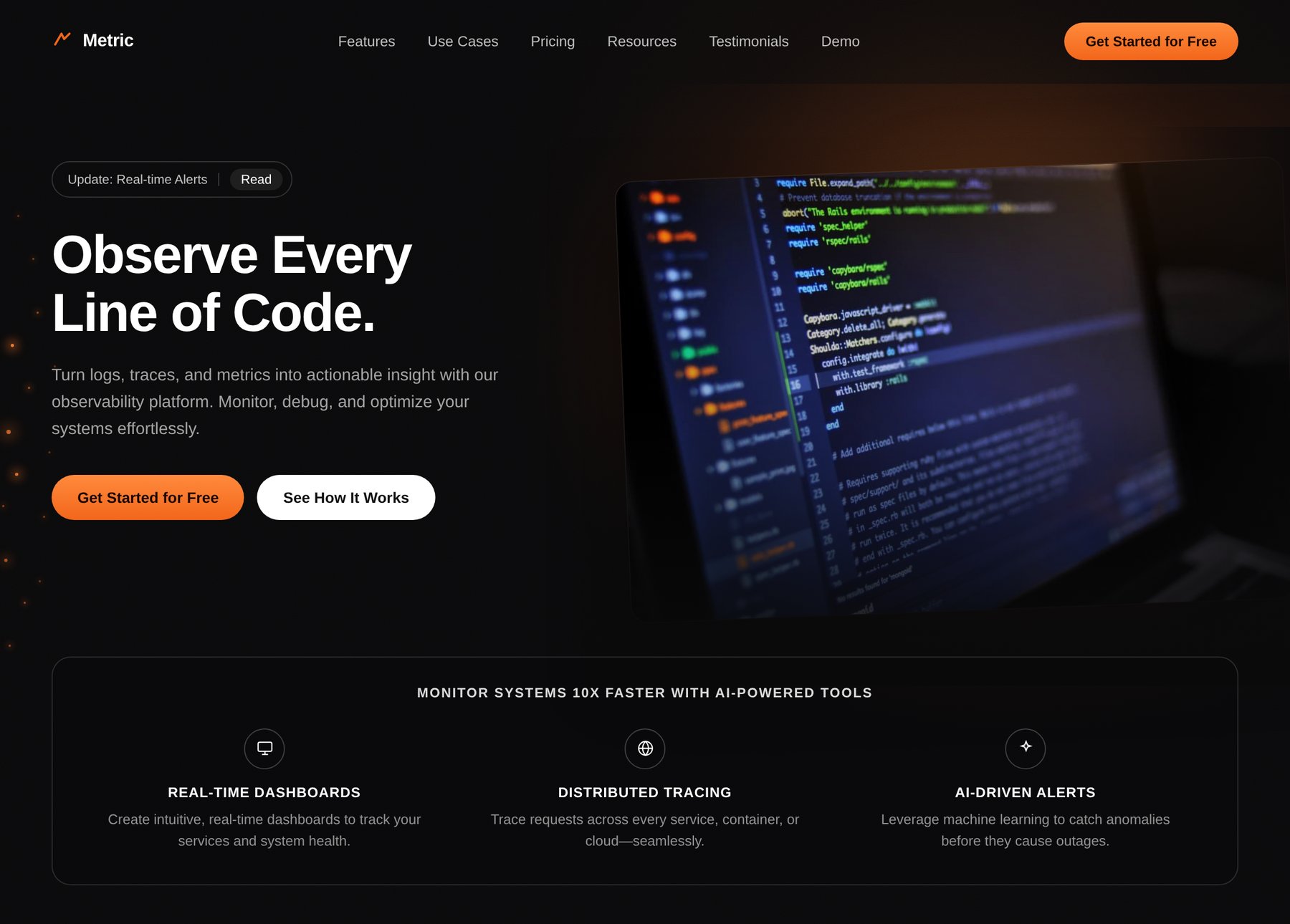
A technical product story told with confidence, not jargon.
AURA
A quiet, editorial site for a boutique hotel built on restraint.
The Challenge
Boutique hotels compete against major booking platforms and glossy chains; a generic template makes them look like anyone else. AURA needed to feel distinct and unhurried before a guest ever calls.
Strategic Direction
Let the property's own atmosphere carry the message — minimal navigation, long-form photography, and typographic restraint over promotional banners and countdown timers.
Design Solution
A dark, editorial palette with a serif display accent for warmth, generous negative space, and a numbered detail system that reads like a printed guide rather than a booking widget.
Design Goal
A homepage that makes "reserve" feel like the natural next step, not a hard sell.
Interface Detail
A restrained top bar keeps navigation out of the way of the imagery, with a single outlined "Reserve" action rather than a filled, attention-grabbing button.
VANTAGE
A listings-first site designed to move buyers from scroll to tour.
The Challenge
Real-estate sites often bury the one thing a visitor actually wants — the property — under generic hero copy and slow-loading carousels.
Strategic Direction
Put the home first: clear navigation, one confident headline, and a single obvious next step — explore properties or book a tour.
Design Solution
A bright, photography-led layout with a dark "Book a Tour" anchor for contrast, disciplined type hierarchy, and a nav that never competes with the listing photography.
Design Goal
Shorten the distance between "I'm looking" and "I want to see this one in person."
Interface Detail
A single dark CTA against a light, sunlit photograph — the one high-contrast element on the page, reserved entirely for the primary action.
FORGE
A confident, industrial identity for a builder that competes on trust.
The Challenge
Construction and contracting firms are chosen on trust and evidence of past work — a flashy site can undercut credibility rather than build it.
Strategic Direction
Let materials and craftsmanship speak: bold, structural typography paired with real project photography and a clear services-to-quote path.
Design Solution
An orange-and-charcoal identity with angular composition, numbered project details, and a persistent quote CTA that never disappears from view.
Design Goal
A site that reads as sturdy and precise as the work it represents.
Interface Detail
A fixed, high-contrast "Get Quote" action anchors the page regardless of how far a visitor scrolls through the project imagery.
NORTHSTAR
A confident consulting front door built for a first, considered impression.
The Challenge
Consulting is an intangible service — the website has to build credibility before a single conversation ever happens.
Strategic Direction
Speak directly to outcomes rather than internal jargon, and route every visitor toward starting a real conversation.
Design Solution
A structured, geometric layout with a disciplined blue accent, clear service pillars, and a single unmistakable call-to-action repeated with intent, not desperation.
Design Goal
A homepage a prospective client would screenshot and send to a colleague.
Interface Detail
A geometric overlay separates the message from the imagery without hiding either — proof and personality sharing the same frame.
VERDE
A calm, clinical-meets-boutique platform for a modern skincare brand.
The Challenge
Skincare and wellness brands must feel trustworthy and clinical without losing warmth — most sites pick one and lose the other.
Strategic Direction
Balance soft imagery with precise, confident copy; foreground the product's function, not only its aesthetic.
Design Solution
A muted, desaturated palette over treatment photography, annotated feature call-outs, and a lightweight lead-capture flow that never feels like a hard sell.
Design Goal
A visitor should trust the science and want the experience in equal measure.
Interface Detail
Annotated call-outs sit directly on the product photography, explaining features in place rather than in a separate list further down the page.
Mood Reference
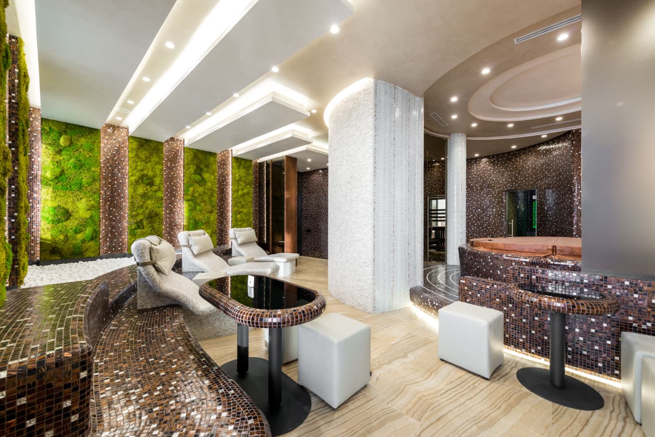
Part of the design brief: the physical treatment space the brand wanted its digital presence to feel as calm and considered as.
NOVA
A technical product story told with confidence, not jargon.
The Challenge
Developer-facing products often drown their value in acronyms; the site needs to prove capability fast to a skeptical, technical audience.
Strategic Direction
Lead with the outcome, back it with a real interface screenshot, and prove depth through named capabilities rather than adjectives.
Design Solution
A near-black interface with a single warm accent color, a live-feeling product screenshot as the hero visual, and a proof strip naming exactly what the platform does.
Design Goal
A technical visitor should understand what the product does within five seconds.
Interface Detail
A three-item proof strip names concrete capabilities instead of adjectives — the fastest way to earn credibility with a technical visitor.